For weekly recaps of The Macro, sign up here.
The following is an adaption of a presentation I give to YC startups before we have them create their presentation slide decks for Demo Day.
Here’s how to make a solid Demo Day slide deck. The thing to remember is that you already have everything you need to create a great presentation.
There are probably 100 reasons why your company is great, but people can only really remember a few of them after a short presentation or pitch. With each one of you, we sat down and figured out the 5 to 7 most important ideas people should know about your startup. These 5 to 7 points are the ones you want investors to remember.
As you experienced for yourselves from Prototype Day 1., you’ll be lucky if they can remember even 1 or 2 of those points in the context of 100 other companies also presenting alongside you.
If you just communicate your points clearly, you’ll do better than 99% of startups. Because before anyone can remember, they have to understand. Here’s how I make things easy to understand:
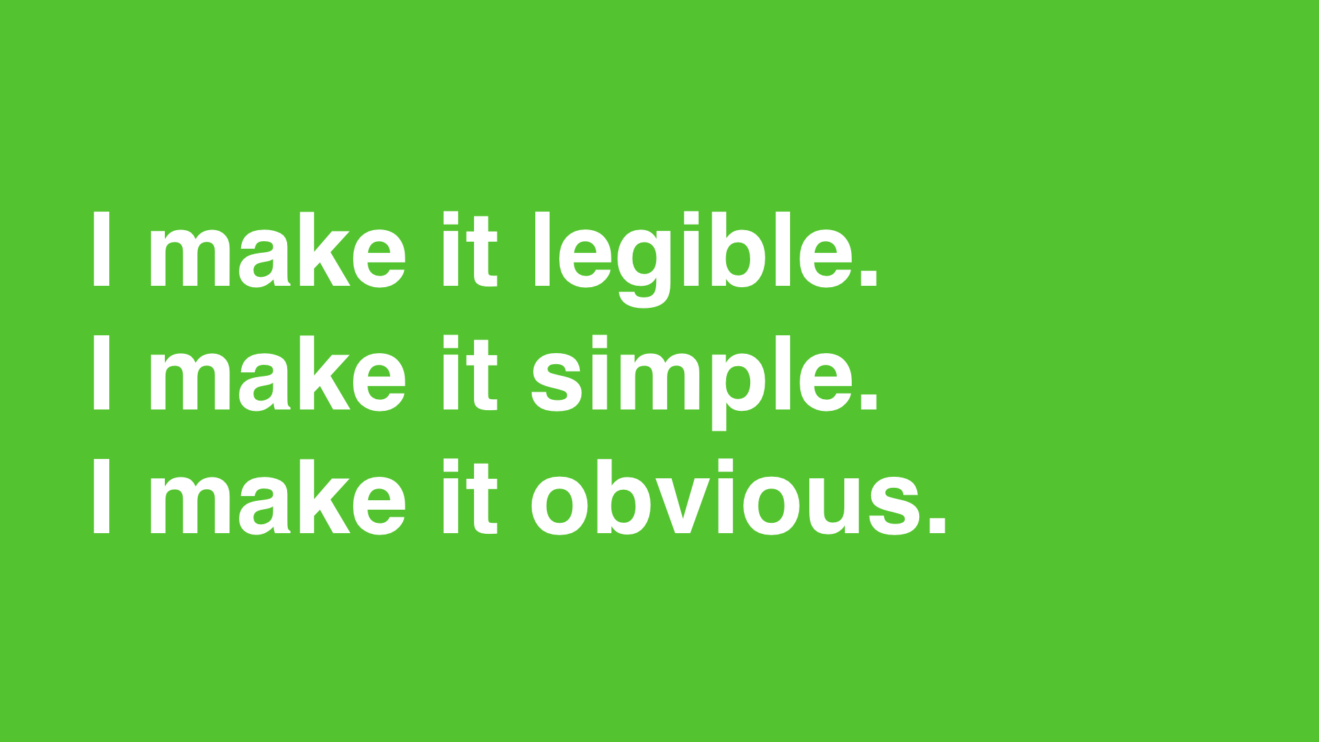
- I make it legible.
- I make it simple.
- I make it obvious.
Here’s how to get people to not understand:

- Making it illegible.
- Making it complicated.
- Making it subtle.
I’m going to hammer this in with some repetition: Your slides should NOT be illegible, complicated, or subtle. Slides should be legible, simple, and obvious.
This is when I give a word of warning before moving forward in my presentation. This presentation has too many damn slides. If this was an actual Demo Day presentation, I’d have stopped a few slides ago. This is a visual essay, which is very different. Please don’t make a visual essay.
Legibility
Alright, let’s talk about legible slides. If they can’t read it, they won’t be able to understand it. At Demo Day, the room will be filled with over 500 people. They can’t all sit in the front row. A good number of them are old-ish people, so their eyesight may not be the best.
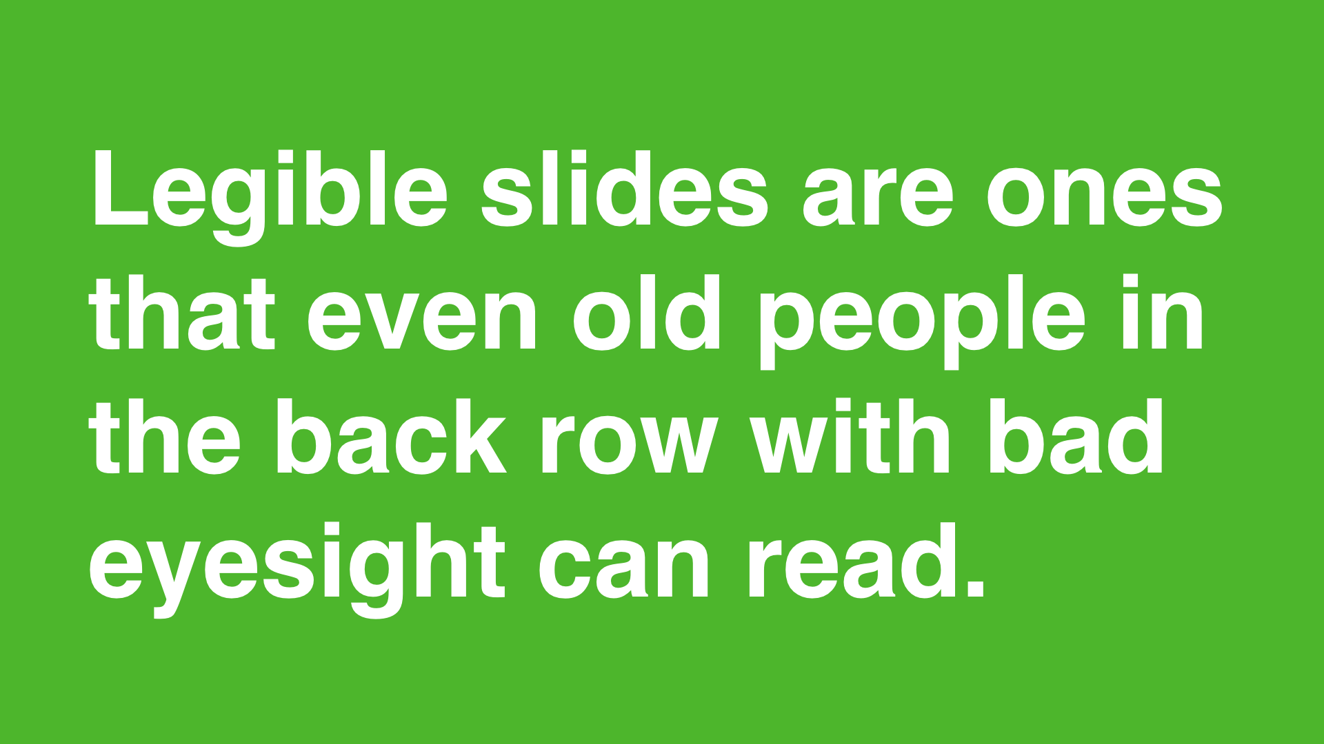
Legible slides are ones that even old people sitting in the back row with bad eyesight can read. Here’s how you do that:
- Use large type.
- Bold text.
- A simple font.
- With good contrast from the background.
Also, text at the top is easier to read from the back of the room. Let’s run through some examples.
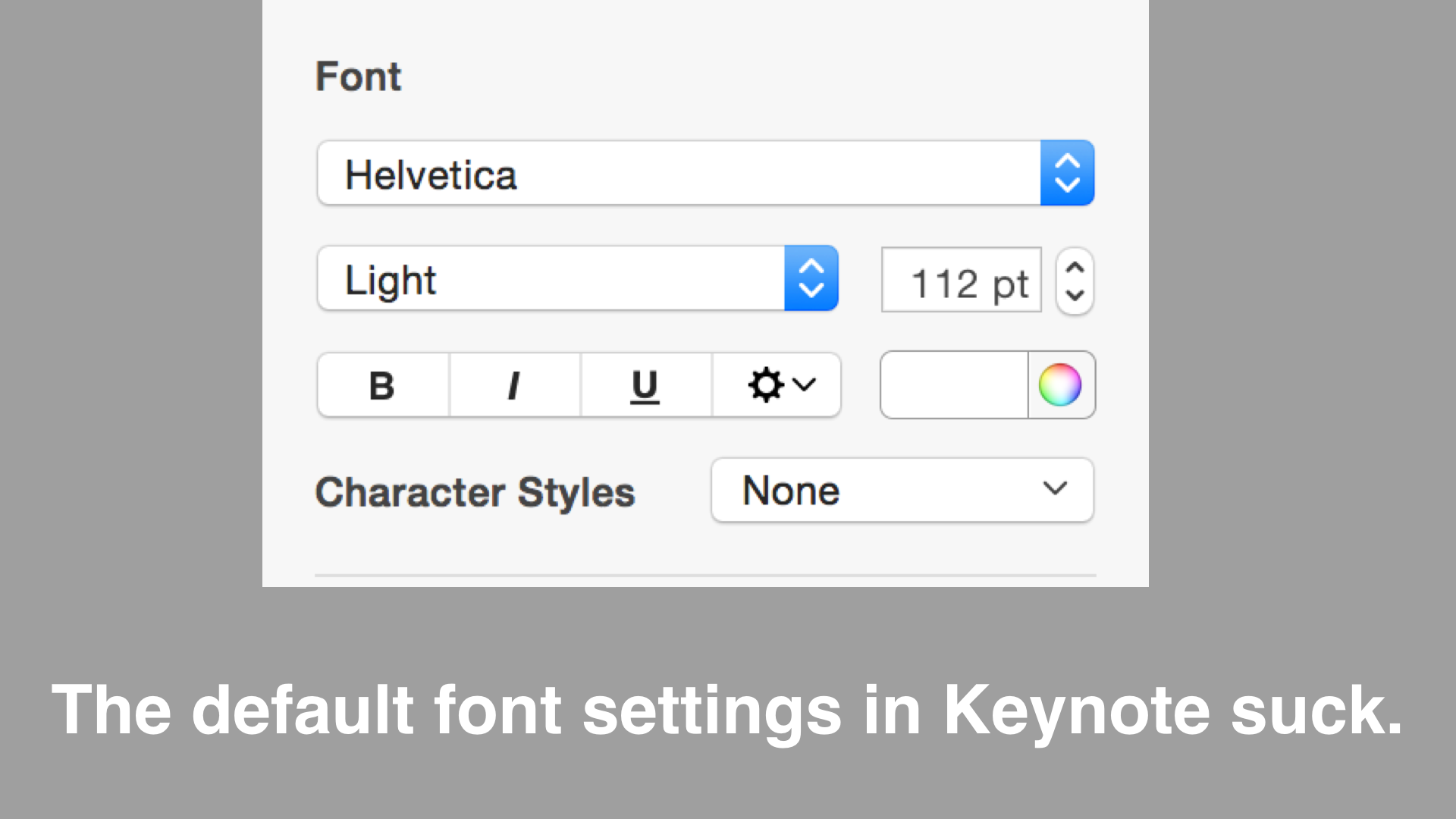
This is not exactly terrible. The problem is the contrast and the positioning of the text. Let's try it again.
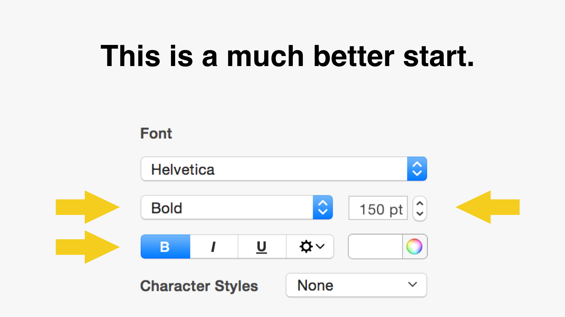
It's better, but there's lots of other text on this slide that's not optimized for legibility because we've allowed the screenshot to be a constraint. Here's a version I know everyone will be able to read from the back of the room.
The following slide comes from Shred Video. It's from their Prototype Day presentation (thanks guys for giving me permission to use this) and it's the one that's supposed to explain what their startup is building.
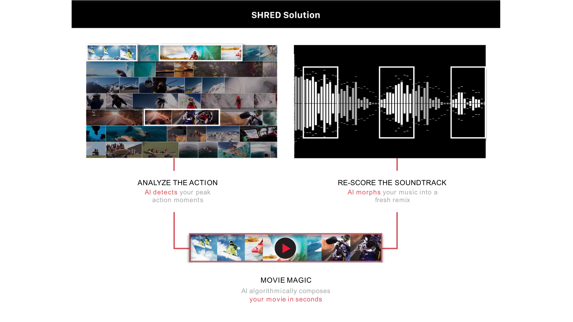
As you can see (or not see), the text is too small and too skinny. The text that actually explains what they do is also at the bottom of the slide. Their technology is amazing. Shred's software can automatically edit videos from hours of raw footage into something that looks like it was made by a professional in just a few seconds. Unfortunately, they've basically hidden it in light gray at the bottom of the slide. By Demo Day, their description simplified and the text they used to describe it was large and in charge.
Simplicity
Let’s talk about simple slides. Simple ideas are easy to understand.

But what does that exactly mean? Well, simple and complex share the same word origin.
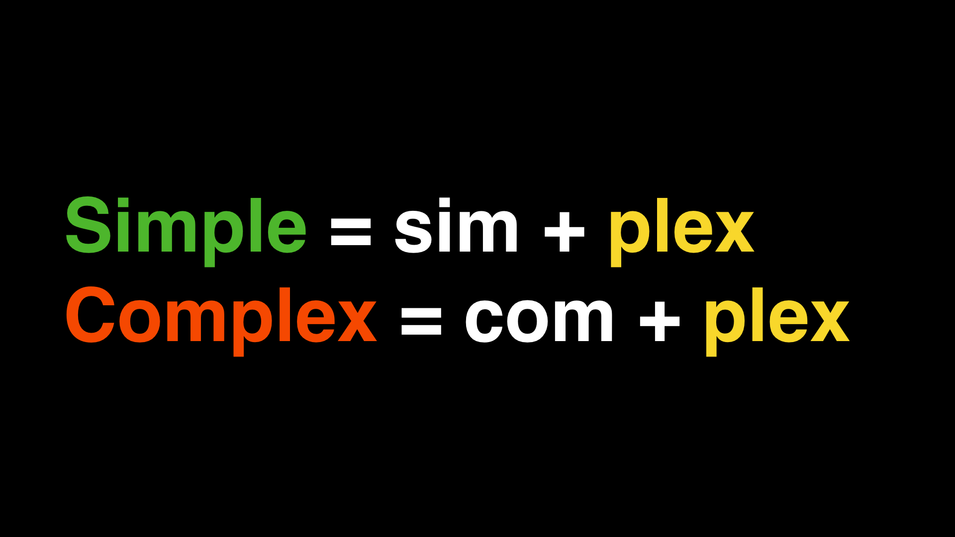
The word ‘plex’ means braid or twist or fold.
- Simple = sim + flex = 1 fold or 1 braid.
- Complex = com + plex = folded / braided together
Simple ideas are ones that aren’t intertwined with other ideas. They are one fold. They are one idea. A simple slide, therefore, expresses one idea. Do not crowd your slides with multiple ideas. That’s how you make it complex. Some ideas may take more than one slide to express a point, but you should try hard to do it in one.

Since you only have 5-7 ideas you want to get across to investors, you shouldn’t have too many slides. Demo Day slides ideally have only about 5-7 slides.
Let's look at another example from one of our startups. Here’s a very early version of a slide from Afrostream explaining what they do.
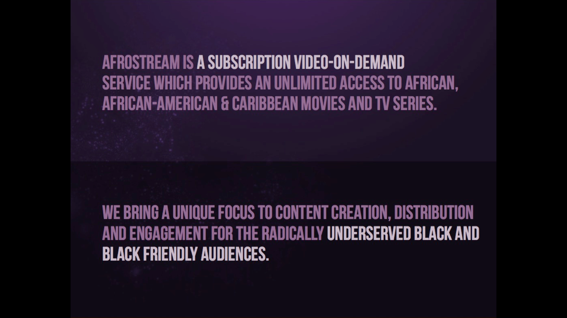
They've put two ideas here trying to convey what exactly they've built and who it's for. Unfortunately, there's just too much text here. It might have been okay if they had just put the highlighted portions, but they made a very common mistake that I see a lot of startups make. They've tried to pack in all the little nuances of their business into this slide. The result is a slide that no one can easily remember.
Contrast this with the slide they end up using on Demo Day to explain their startup:

Ahhhh, it's like a breath of fresh air. Short, sweet, and easy to recollect. Once you decide what idea you're going to try to convey on a slide, you've got to figure out how to make sure your audience finds that idea. The best way to help people find the one idea on each slide is to make it obvious.
Obviousness
Let’s talk about obvious slides. Obvious slides are ones that can be understood at a glance. Here’s a simple test you can use to test if a slide is obvious: Show it to a stranger and ask them to tell you what it means. If they don’t immediately say your idea, you lose.
This is because ideas that are obvious are very fast to understand. Why do we care about the speed of understanding? Well, for a Demo Day presentation the following two things make it very tricky for you.
- You only have 2 minutes and 30 seconds.
- People are easily distracted.
In fact, investors are even more easily distracted than most other people. They are easily distracted because they are impatient. If they don’t get your point right away, they will check their email.
We can’t force investors to stare and listen to you the entire time. And to be honest, it’s hard to focus intently on over 100 presentations even if it’s your job. Have some empathy! The way to mitigate this is to make sure any slide you show can be immediately understood. That way they’ll just get it when they look up from checking their email.
Here’s how I make things obvious: I start by making it legible and simple. (See two points above.) Then I try to make my idea explicit. Here’s an example:

That slide isn’t explicit. You can probably guess and figure out it represents some kind of growth graph, but it isn’t immediately clear.

This is better, but the idea I want to express could be more in your face.

Boom. It's like I put CliffsNotes right on the slide. No need to guess how my startup is doing, I made it explicit. Here’s another variation from one of our startups.
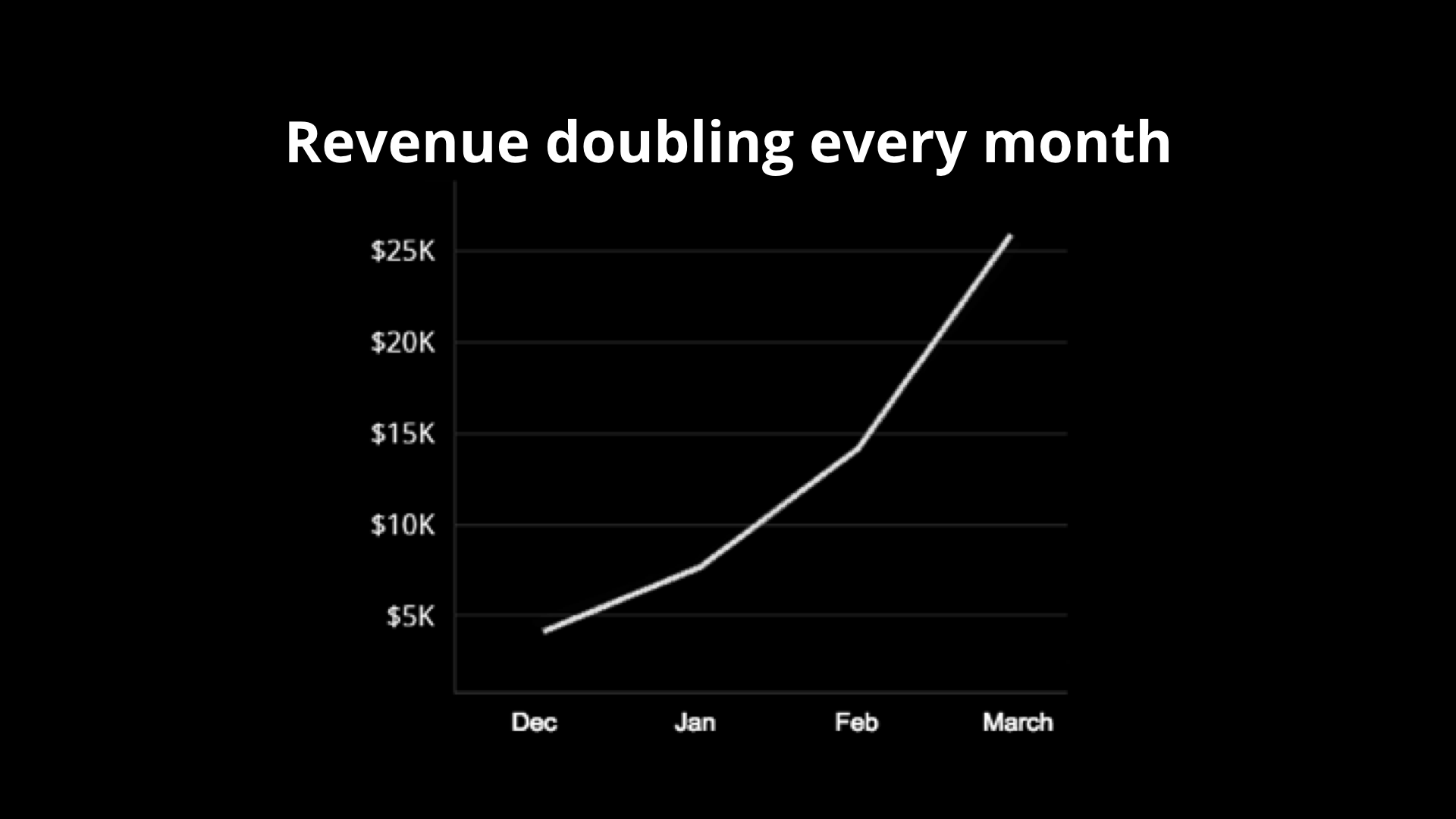
Without the caption, you’d have to study the graph to get to that conclusion. Just writing it out like that means I barely have to look at the graph at all.
Another way I make my slides obvious is to avoid distractions in my slides. Now, when I say distractions, I mean information distractions. Here’s one way to show how Dropbox works:
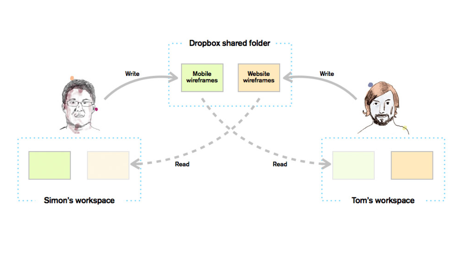
Not bad, but not obvious. The problem is people can’t understand that slide immediately. Why? Well, there’s a lot of information on that slide. See?
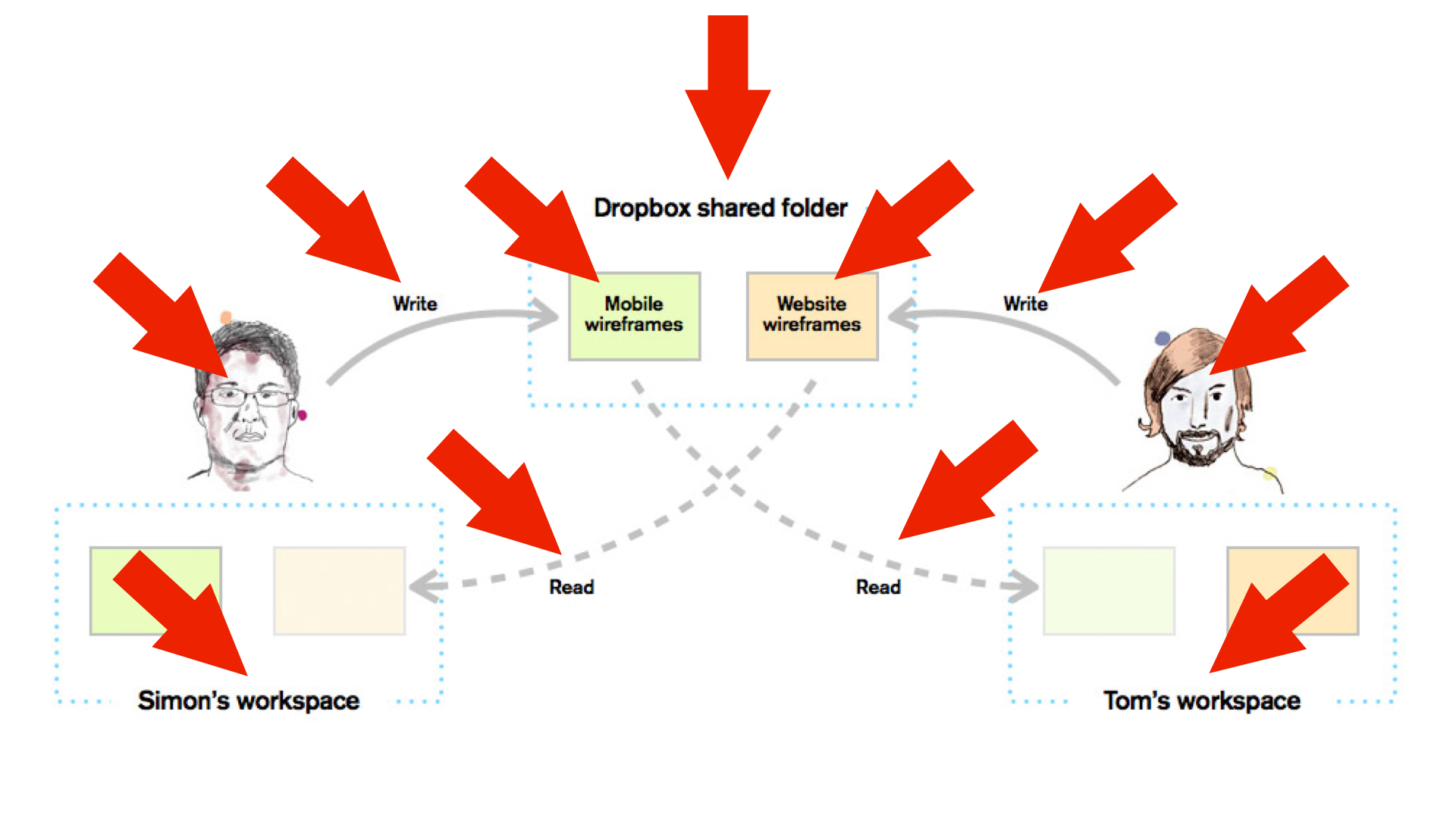
All that crap takes time to comprehend. There’s actually a law of human interaction called Hick's Law that describes how each piece of information we add to a problem comes at a cost–-increasing the number of choices will increase the time it takes to make a decision logarithmically.
To me, diagrams are like little mazes for ideas. It usually makes the path to the idea you want to express too long. And you don’t want investors wasting time trying to figure out a diagram. You want investors to just understand immediately—immediately why you’re awesome. So the path to the idea should be straight and quick.
Here’s some other distractions you should avoid in your slides.
- Too much text.
- Excessive explanations and caveats.
- Excessive branding per slide.
- Photos with no titles or captions.
- Animations.
- Transitions.
- Memes.
- Subtle humor.
- Accidental humor.
Basically, don’t try to make the slides the thing they’ll remember.

Investors invest in teams not slides. Your slides should make your ideas more clear. Don’t let your slides distract investors from what you’re saying out loud. You want them to be impressed by you. Not your slides.
There is, however, one exception I have for this rule: when your point is to show complexity or to overwhelm the audience. This usually happens when a startup wants to talk about how hard a problem is that they're solving. I’ll give you an example from Magic’s slide deck.
On that slide they make the point that their software abstracts away thousands of services into a single interface. To bring the point home, they show a slide of every on demand service they could think of in every industry, market and vertical organized on a grid.
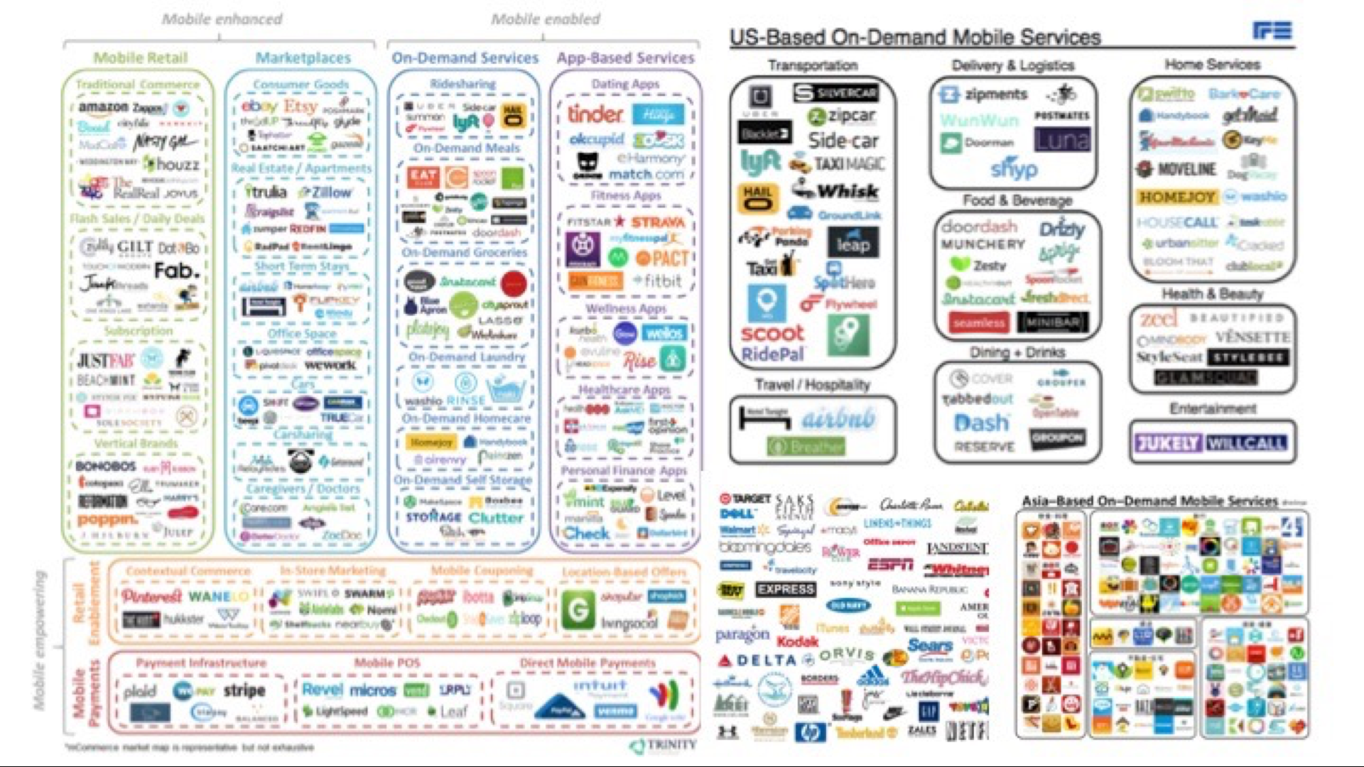
Normally, it's not ideal to show a slide of every potential competitor out on the market. The logos, however, represent the problem. For users to take advantage of all these services, they'd have to create an account for every single one. It's a discovery and usability issue. Each logo also represents every business Magic is now able to charge a premium on top of to solve their users' problems. It's overwhelming for a reason and that's usually when it's okay to bend the rules.
Fucking Screenshots
Let’s talk about screenshots. I usually hate screenshots in Demo Day presentations. Screenshots are almost always illegible, complex, and non-obvious. They break all 3 rules! The text in most interfaces are too small (not legible). Most interfaces do multiple things (not simple). Most screenshots take longer than a glance to understand (not obvious). They are the worst.
Here is a Google image search for ‘screenshots’:
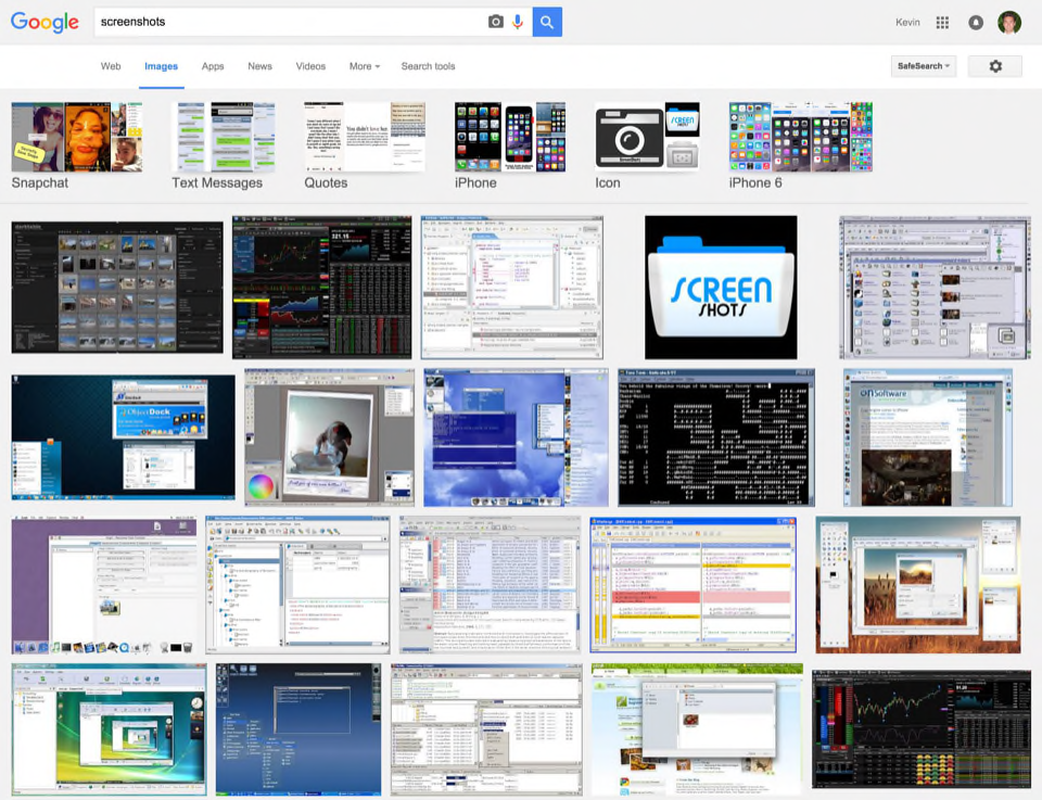
Can you understand any of those images immediately? Nay.
If you’re trying to show what you do, I recommend showing the most simplified version of it. A bulleted list of steps is my favorite technique for this.
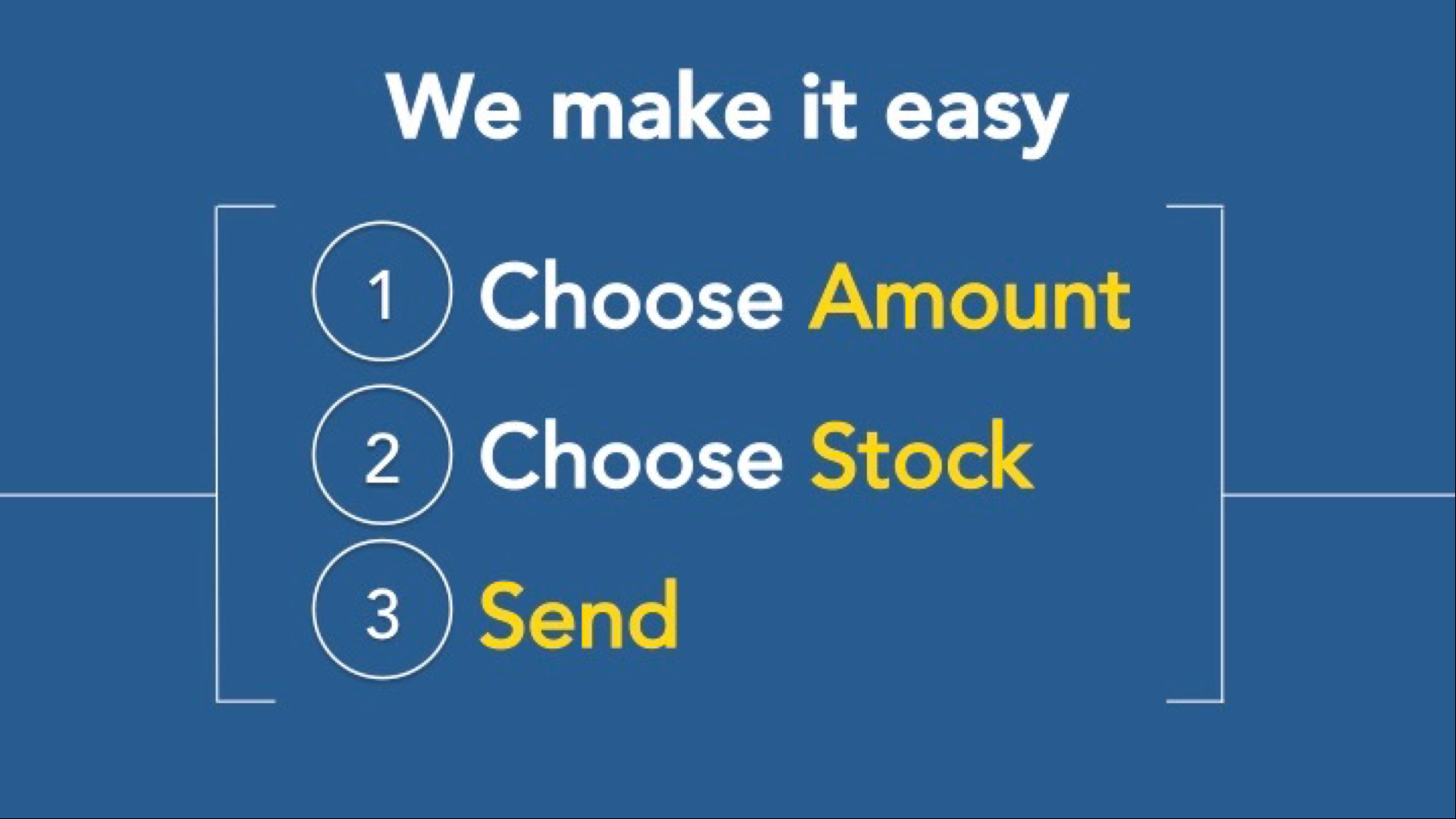
That slide is far better at explaining the ease of use of SparkGift's product than any workflow they could show from their actual interface. Sometimes a company can get lucky and explain what they do in two points. Here's how Meadow did it:

In my opinion, this slide is far better than any combination of buttons, links and chrome they could have put up there to express the same idea.
The frustration I have for screenshots in pitch decks goes for screencasts and videos as well. Think twice before trying to use either one.
Alright, so there’s probably a lot more you can do to improve your slide deck, but this is a pretty good start. Again, here’s how to make a solid Demo Day slide deck:
- Make it legible.
- Make it simple.
- Make it obvious.
If you just do these three things, you’ll have a presentation that anyone can probably understand. And since understanding is the foundation for getting someone excited enough to want to talk to you afterwards, it’s a good place to start.
Sign up for weekly recaps of The Macro.
Notes
Two weeks into a batch we hold an event called Prototype Day for all the startups to present to one another for the first time. What they realize quickly is how bad they are at describing their startups in a way that gets even their batchmates to remember. ↪